
Custom Logo T-Shirts at Production Volume: Matching the Method to the Artwork
Logos fail on garments when the method does not suit the artwork. Match the mark - fine line, bold fill, gradient, text - to screen print,…
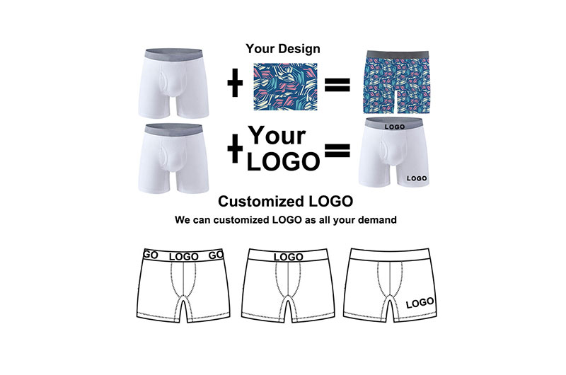
Most logo problems on T-shirts are decided before production starts, at the moment a brand chooses a decoration method for artwork that does not suit it. Fine line work, bold filled lettering, gradients and small text each behave differently under screen print, embroidery and transfer, and the correct method follows from the artwork rather than from what a supplier happens to run most often.
Why does the artwork decide the method?
Each method renders features differently.
Screen print reproduces flat shapes and bold type cleanly, embroidery handles small defined marks and texture, and transfers manage gradients and fine detail that flat colours cannot.
| Logo type | Method that suits it | What fails |
|---|---|---|
| Bold fill, one or two colours | Screen print | Digital print may fade sooner |
| Fine line and small type | Screen print or transfer | Embroidery closes letters up |
| Gradients and photographic marks | DTG, DTF or simulated process | Flat spot colours lose the detail |
| Textured, three-dimensional mark | Embroidery | Print cannot reproduce relief |
The practical approach is to start from the brand mark rather than from the catalogue. Ask a supplier to state which methods it would use for the specific artwork and why, then test the answer on a sample. A supplier that recommends one method for every logo is describing its equipment rather than the design.
It also helps to separate the mark into its parts before choosing. Many logos combine a symbol, a wordmark and a line of smaller type, and those three elements have different tolerances: the symbol may reduce well, the wordmark may need to stay at size, and the smaller type may have to be dropped at certain print dimensions. Deciding which parts are essential at each size prevents a mark that is technically reproduced but visually compromised.
What changes when the mark is small?
Less detail survives, in every method.
Small marks lose fine strokes, closed counters in letters and any gradient, so the artwork usually has to be simplified rather than shrunk.
This is where brands most often need an alternative positioning decision. If the mark cannot be simplified further, moving the branding to the neck label, the sleeve or the packaging preserves the identity at a size where it can be reproduced accurately. Ask the factory what the smallest legible size is for the method it proposes, using your actual artwork, because the limit depends on the strokes rather than on the overall dimensions. A logo with fine details has a higher minimum legible size than a solid block, and the test should be run on the real mark rather than on a generic sample.
The solution is often a simplified variant rather than a smaller mark. A single-colour silhouette or a monogram derived from the full logo can be reproduced at sizes where the complete mark cannot, and it can sit alongside the primary logo in a documented system. Asking a designer to produce that variant before the production artwork is finalised costs far less than discovering the limit during sampling.
Which branding positions suit a logo programme?
Neck, chest, sleeve and hem, each with a different function.
The chest position is the most visible on a standalone shirt, the sleeve works on garments with a defined sleeve, the hem is subtle, and the neck label is seen at unboxing and in wear.
For a branded tee programme, the effective combination is usually one prominent placement and one subtle one: a chest or sleeve mark carrying the identity, and a neck label carrying the brand at close range. That structure also spreads the cost, since a small neck label can be produced once and used across the range while the chest mark is designed per style. Ask what each position costs in setup and whether the same screen or file can be reused across styles, because a programme usually shares artwork more than it shares garments.
The neck label also has a practical advantage that is easy to overlook: it is applied to every style in the range regardless of the decoration plan, so it carries the brand even on garments where a chest mark is omitted for cost reasons. A brand building a range in stages can therefore keep a consistent identity while adding prominent placements only where the budget allows.
How should brand colour accuracy be handled?
Against a physical standard, not a screen.
Screen colours vary between devices and lighting conditions, and ink mixed to a screen reference will not match the intended brand colour in production.
Ask for the ink to be matched against a physical standard, and request a printed swatch of the matched colour on the garment colour rather than on white paper, because the ground affects how the ink reads. Where the brand has a defined colour system, provide the reference and confirm how the factory proposes to translate it into ink, since not every brand colour can be reproduced exactly in every ink system. Where an exact match is impossible, agreeing an acceptable variant before the run is better than discovering the difference on delivery.
How does garment colour change the logo?
By changing contrast, not the ink itself.
The same mark reads differently on white, mid-tone and dark garments, and a design that works on a light ground can disappear on a dark one.
This is why artwork approved on a white sample should be re-checked on every colour in the range before production. On dark grounds, some methods require a base layer to carry the ink, which adds a screen and a step to the process and can change the hand feel of the mark. Ask the factory how it handles the range of garment colours you intend to sell, and test the mark on the lightest and darkest grounds. Where the design cannot work on a particular ground without a base layer, that is a specification decision rather than a printing fault.
Where the range is wide, it is worth deciding whether every colourway should carry the same mark. A light mark on a light garment and a base-layered mark on a dark one are technically different products, and a brand that accepts that difference can keep a wider colour range than one that requires identical treatment across every ground.
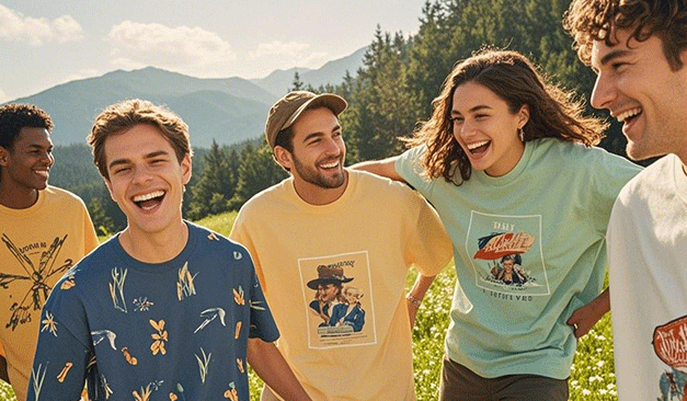
What does a pre-production sample need to prove?
That the mark reproduces on the actual garment.
The sample should use the intended fabric, the intended garment colour, the final artwork and the proposed method, and it should be washed before approval.
Anything less produces a misleading result. A mark approved on a different fabric may behave differently under washing, and a mark approved on a white shirt may not survive the move to a dark ground. Ask for the sample to be washed at the temperature stated on the care label and inspected for cracking, lifting and colour retention, then retained as the production standard. Where the range includes several garment colours, a sample of each is worth the cost, because the appearance of the mark changes more between colours than between sizes.
How does the cost scale with logo size and volume?
Size affects material; volume affects setup.
A larger mark uses more ink or more stitches, while the setup cost is fixed per design and per colour regardless of size.
That means the cost difference between a small and a large logo is modest once setup is paid, while the cost difference between one and three ink colours is substantial. Ask for the artwork priced at two sizes and two colour counts, which shows where the real leverage lies. On most branded tee programmes, the useful saving comes from reducing the number of elements rather than from shrinking the mark, because a slightly smaller logo rarely changes what the customer perceives.
Where the brand needs the identity to be visible at a distance, the size question is worth revisiting against the garment rather than against the file. A mark that looks generous on a screen can read small on a broad chest, particularly on an oversized fit, so the practical test is a sample photograph at the distance a customer would encounter the shirt.
What should be retained for future orders?
The file, the reference and the sample.
Five items turn a decorated programme into a repeatable one, and each is a document rather than a garment.
- The final artwork file with the placement and size specification.
- The screen, film or digitised file, or confirmation that it is stored by the factory.
- The ink, film or thread reference matched against the brand standard.
- The washed sample approved for production.
- The placement tolerance agreed with the factory.
Keeping these five items makes the second order cheaper because the setup work is already done. Ask who holds each item and whether it will be supplied in a usable format, since a file that exists only in a supplier’s system is not an asset the brand controls.
FAQ
How much do custom logo shirts cost?
Cost follows the method, the number of colours or stitch count, the size of the mark and the quantity. Setup is fixed per design, so the unit price falls as volume rises and the artwork is reused. Ask for the mark priced at two colour counts and two sizes to see where the leverage is.
What is the best way to put a logo on a T-shirt?
It depends on the artwork. Bold fills and straightforward type suit screen print, small defined marks suit embroidery, and gradients or fine detail suit digital or transfer methods. Ask a supplier to explain which method it would choose for your specific mark and why, then confirm the choice on a washed sample.
Where can I get custom logo T-shirts made in bulk?
From a manufacturer that controls both the garment and the decoration, so the fabric and the method are chosen together. Ask which decoration methods are applied in-house, how the logo is matched to a brand colour, and what tolerance it can hold on placement at volume.
How long do printed logos last on T-shirts?
Durability depends on the method, the fabric and the curing or pressing rather than on the logo itself. A correctly cured screen print generally outlasts surface-applied methods, while transfer-based marks are more sensitive to pressing and washing. Ask for a sample washed at least ten times before you approve the method.
Next step for your team: send the Finetex Global team your logo files and intended garment colours, and ask which method suits the artwork, how the brand colour will be matched, and what the placement tolerance is at volume.
Sources: OEKO-TEX STANDARD 100; OEKO-TEX ECO PASSPORT; 16 CFR Part 303 textile labelling; Supima — extra-long staple cotton; ISO 9001 quality management.
More factory-floor notes for brand owners

Sample Revision Limits: How to Control Underwear Development Cost and Calendar
A sample revision limit should control scope, not block necessary correction. The buyer and factory need to distinguish…
Read more →
Lab Dips and Strike-Offs for Underwear: Approval Steps That Prevent Delays
A lab dip approves a dyed textile shade; a strike-off approves printed artwork on the intended substrate. They…
Read more →
Color MOQ Planning: How to Share Fabric Across Multiple Underwear Styles
Color MOQ planning works best when a brand treats dyed fabric as a shared material platform rather than…
Read more →
Underwear Fabric Utilization: How Marker Efficiency Changes Unit Cost
Fabric utilization converts a fabric quotation into a garment cost. The calculation must account for pattern area, fabric…
Read more →
Open Costing for Men’s Underwear: Reading Fabric, Trim, Labor and Overhead Lines
An open-cost sheet is useful only when every line is tied to a measurable specification, a purchasing unit…
Read more →Global Apparel Sourcing Outlook 2026: Cotton, Freight and Supply-Chain Risk
A data-led 2026 apparel sourcing outlook on cotton balances, freight volatility, supplier diversification, lead time, compliance and practical…
Read more →Request a sample & pricing information
Send us your tech pack, target price or a reference sample — we reply with a quotation, a realistic lead time and a fabric recommendation within one working day.
- Free sampling plan & cost breakdown
- MOQ from 300 pcs per style
- Reply within 1 working day