
What are the 14 best fonts for embroidery design: How to Read the Lists (and What They Leave Out)
A private-label programme is two weeks from its launch date when the first bulk cartons arrive and the chest wordmark reads as a dark bar from…
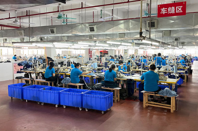
A private-label programme is two weeks from its launch date when the first bulk cartons arrive and the chest wordmark reads as a dark bar from a metre away, letters closed up and outer strokes lost. The tech pack was not wrong and the fabric match was clean, so the cost of the correction lands on the brand. The gap sits between an approved font and a stitched garment, and published font lists do not close it: they judge typefaces on how they look on a screen and leave out the digitising, backing, thread and inspection decisions that decide the result on a knit. This article reads those lists as a shortlist, then sets out the criteria and the checks that turn a name on a list into a production-ready wordmark.
The short answer on choosing a font for embroidery
Font lists are a shortlist of letterforms, not a production decision. What survives on a stitched garment is usually moderate stroke weight, open counters and generous spacing, tested as a sewn-out sample on the actual knit in the actual colour. Finetex Global does not sell typefaces; it tests how a chosen font behaves in production.
The fourteen names that keep reappearing, and what actually decides between them
Nearly every published embroidery font list resolves to the same small group of letterforms, and that repetition is useful as a shortlist. Grouping the entries by stroke behaviour is more practical than ranking them: what decides a clean result is mechanical, from how the strokes thin out to how much space the letters need at the size the brand intends to stitch.
The typeface itself is licensed from the person who drew it, and a garment factory neither owns nor licenses one, so that choice belongs to the brand. What a manufacturer can verify is narrower: whether the letterforms hold their shape after digitising at the size and placement on the order, whether the thread and backing suit the knit underneath, and whether the stitched area measures the same after the wash the care label promises. Each of those questions has a document behind it, which is why the answer sits at sampling stage rather than in a type specimen. Fix the placement dimensions, the minimum letter height and the artwork revision count before the purchase order confirms them.
Read the table as a filter, not a ranking. A typeface becomes production-ready only after it is digitised for the intended fabric and checked as a sewn-out sample.
| Typeface as usually listed | Letterform group | Why lists include it | What decides the stitched result |
|---|---|---|---|
| Helvetica | Grotesque sans | Neutral corporate default | Uniform strokes hold up; the tight default spacing has to be opened at small sizes |
| Arial | Neo-grotesque sans | Familiar and available everywhere | Even weight survives reduction, but closely spaced letters merge |
| Futura | Geometric sans | Modern and retro-clean | Circular shapes read well; thin joins need more height |
| Century Gothic | Geometric sans | Wide, friendly brand mark | Even weight, but the wide fit limits characters per placement width |
| Montserrat | Geometric sans from screen work | Contemporary brand type | Heavier weights stitch cleanly; light weights need height and spacing |
| Optima | Humanist sans with flared stems | Elegant, low-contrast finish | Flared stems give a smooth edge; apertures still need opening |
| Garamond | Old-style serif | Classic, formal tone | Fine serifs and thin strokes need a larger minimum height |
| Baskerville | Transitional serif | Refined, literary feel | High thick-to-thin contrast has to be reduced before digitising |
| Bodoni | Didone serif | Fashion and editorial marks | Hairline serifs are the first element to disappear in stitch |
| Times New Roman | Transitional serif | Ubiquity and familiarity | Narrow stems and small apertures close up when reduced |
| Cooper Black | Rounded display serif | Retro, heavy identity | Very heavy strokes need stable backing and a wider placement |
| Brush script | Casual script | Handwritten personality | Reads best large, in short words, over an even underlay |
| Old English or blackletter | Blackletter | Heritage and streetwear marks | Dense ornament closes up below a large decorative size |
| Collegiate block with outline | Slab or block lettering | Team and varsity programmes | A single-colour block holds; the outline or tail is what fails |
Four criteria separate the entries. Uniform stroke weight survives reduction better than a high-contrast face. Open counters keep letters readable at chest, cuff or waistband scale. Print and screen files arrive with tightened letter spacing, which has to be opened for stitch. Filled areas and fine outlines are simplified most often, and they are what turn one artwork revision into a re-stitch. Finetex Global neither designs nor licenses typefaces and holds no position on these lists.
Practical note: send the shortlisted artwork at the largest size it will be stitched before the placement is confirmed.
Stitch-out quality: what separates a clean wordmark from a rejected batch
A clean wordmark is a stability result, not a design result, which decides where the attention goes. Letterforms hold their shape only when the surface beneath them is held steady during stitching, and that depends on digitising, underlay and backing rather than on the typeface.
Digitising turns artwork into a stitch programme that sets direction, density, underlay and sequence. A knit moves under the needle, so pull compensation and underlay are adjusted for the fabric, and small detail is simplified where the surface cannot hold it. Backing follows the design: a cut-away stabiliser supports a dense fill, a tear-away suits light detail on stable fabric, and wash-away topping stops stitches sinking into a brushed face.
The evidence that a programme is under control is documentary. Colour fastness and shrinkage reports, fibre composition and chain-of-custody documents for claimed fibres such as bamboo and TENCEL, and buyer-specific testing through SGS, Intertek or Bureau Veritas all sit in the order file before shipment. Care symbols follow the system published by GINETEX, and the practical step is to approve the backing type and the interior finish on the sewn-out sample.
From artwork to sewn-out sample: putting a wordmark onto a knitted surface
The fastest route to a stitched mark that matches the mock-up is to treat the first sample as a fitting exercise, not a formality. Development work at Finetex Global covers tech-pack review, pattern making, grading, fit correction and fabric matching, and decoration is settled inside that plan instead of being added after the garment is approved.
Two sample stages matter for a decoration programme. A fit or development sample runs in roughly 5 to 7 working days and a graded size set in roughly 10 to 12 working days, built from the bulk fabric where the fabric is relevant. Programming the embroidery on the development sample puts the stitched mark, the fabric and the shade in one photograph, which is the dependable way to judge letterform behaviour. Placement should be dimensioned from a defined reference point so it can be checked on every size in the range.
Timings and volumes are indicative and subject to the latest quotation, and the sequence behind a first order is set out in the sampling costs and timelines guide. Hold the approved physical sample, with its thread references, on both sides.
The flexibility a decoration programme actually needs
Flexibility is worth little unless it is specific, so the useful question is which variables a supplier will move without re-quoting the whole programme. Placement, thread colour, size range and order volume are the four that change most often between the first quote and the purchase order.
Placement flexibility covers chest, sleeve, hem, cuff and hood positions on a knit, and thread colour is normally specified as a relationship to the garment rather than an exact match, because thread comes in a discrete range of shades. Volume is where most programmes are decided: Finetex Global quotes 300 to 3,000 pcs per style, with stock-fabric styles able to start from 300 pcs and a fully custom knit or dye lot usually starting at 1,000 pcs per colour, and roughly a third of programmes start below 1,000 pcs per style.
Quotations are held for 90 days, one named merchandiser owns the order, and updates are written weekly. All figures are indicative and subject to the latest quotation. Ask which of the four variables changes the price and which changes the calendar, because the second answer decides the launch date.
Where decoration money goes, and why a low unit price can cost more
Embroidery is priced on machine time, so the drivers are the stitch count and the number of colour changes rather than the visual size of the mark. A dense fill in several colours consumes more machine time than an outline in one colour, so two treatments of one logo can sit far apart on a quotation.
Two costs sit outside the unit price. Digitising is one-off engineering work, and every artwork revision that changes the stitch file repeats part of it; a re-stitch after bulk costs more again, because the garment is usually lost as well as the machine time. Sample charges at Finetex Global are credited against the bulk order, so a sample cost in a quotation is not the final cost of the programme.
Comparison is meaningful only when quotes are built the same way. A quotation that shows fabric, labour, trim and packing separately can be checked against another of the same structure; a single unit price hides whether the saving came from thread, backing or a lighter fabric. Compare two suppliers on identical placements, thread colours, sizes and packing.
Matching the route to the project: value, premium, sport and sustainable ranges
The decoration question resolves quickly once the project type is fixed, because each range has a default that follows from its fabric and its retail channel. A value programme wants a mark that costs little machine time, a premium programme wants the mark to sit quietly inside the fabric, a sport range needs the stitched area to hold under stretch, and a sustainable range is decided by documentation before artwork.
Routing all four the same way is where brands lose money. A dense multi-colour fill on a lightweight knit creates a stability problem, while a fine tonal mark on heavyweight fleece can disappear in the pile. The table sets the four routes side by side with their volume and inspection implications.
| Project type | Decoration route that fits | Fabric route | Volume route | Where the inspection attention goes |
|---|---|---|---|---|
| Value basics such as multipack underwear and plain tees | One- or two-colour flat mark at chest or waistband scale | Stock fabric in held shades, 120 to 180 gsm | From 300 pcs per style on stock fabric | Shade continuity across the multipack and consistent sizing |
| Premium ranges in modal, pima or lyocell | Tonal thread, low-contrast mark, interior finish kept smooth | Custom knit or dye lot for shade control, 140 to 220 gsm | Typically from 1,000 pcs per colour | Colour fastness and shrinkage reports, backing finish on the inside |
| Sport, compression and performance lines | Condensed block mark in high contrast, sleeve or hem placement | Performance knit with elastane and moisture management | Depends on the base knit held by the fabric partner | Recovery after washing and how the stitched area behaves under stretch |
| Sustainable and certified ranges | Simple single-colour mark, thread and trim inside the certified scope | Certified fibre with chain-of-custody documents | Custom lot, typically from 1,000 pcs per colour | Documents before claims: fibre composition and chain of custody |
Practical note: write the range type on its own line of the tech pack and price it as its own route, because a mixed line usually ends up priced as the most expensive style in it.
Cost and MOQ breakdown: the fabric share, weight and elastane trade-offs
Fabric is the largest single line in a decorated knitwear quotation, typically 45 to 60% of unit cost, with labour, trim and packing following behind. The cheapest lever on a garment-level quotation is therefore rarely the decoration: it is the weight and count of the knit underneath.
Three specification decisions drive most of the variation. Total weight per garment sets the material bill, so a move of 100 gsm across a programme shifts the price far more than a change of thread or backing. Elastane improves recovery at waistband and cuff, but it adds cost and needs a stability check after the wash the label promises. Finishing changes how a fabric behaves at the cutting table, so a washed fabric is quoted as what it becomes rather than the roll it starts from.
Volume follows the same logic: 300 to 3,000 pcs per style, from 300 pcs on stock fabric, and a custom knit or dye lot typically from 1,000 pcs per colour, all indicative and subject to the latest quotation. Combining several basics on one plan, such as decorated T-shirts with men’s underwear, usually holds better fabric pricing.
Pre-production tests and QC gates a decorated order should pass
Most decoration complaints after shipment were visible in the bulk roll or the first hundred pieces, which is why the gates that matter sit before cutting rather than at the loading dock: fabric tested before it is cut, the run checked while it is still running, the goods inspected before they are packed.
Bulk fabric inspection covers shade continuity, shrinkage, weight per square metre and colour fastness. In-line checks run at roughly 30% and 70% of the run, where a drifting shade or a shifting placement is still a workshop problem rather than a shipment problem. Final random inspection is AQL 2.5 with a photo report before packing and shipment, measured against a version-controlled specification with an approved physical sample held by both parties.
Documentation carries the rest of the load. OEKO-TEX Standard 100 is the material-safety reference most retailers ask for on thread, trims and fabric, fibre and care wording for the US market sits under the Textile and Wool Acts with the FTC labelling guidance and 16 CFR 303, and retail-ready packaging needs a scannable identifier built to the GS1 barcode standard.
How to start: sampling, specification lock, then bulk
The sequence that prevents most decoration problems is short and unglamorous. Send artwork, the intended placement, the fabric and the target quantity, and the reply is a costed quotation within one working day with fabric, labour, trim and packing shown separately. Sampling then settles two questions at once: whether the letterforms behave on that knit, and whether the thread relationship to the garment shade is acceptable.
Where the knit is not on a shelf, the base fabric is specified, tested and approved before it reaches the cutting table through the custom fabric development route, where weight, composition and stretch are fixed against the decoration that will sit on them. Once the pattern is graded it is locked, so bulk runs against a fixed reference rather than a series of adjustments.
Whether the order is a 300-piece test on held fabric or a 1,000-piece custom colour lot changes the sampling plan, the quotation and the calendar, and the three are easier to price together than to re-quote later. The boxer briefs factory range shows the constructions that most often carry a small stitched mark.
FAQ
What are the most popular embroidery fonts?
Across published lists the recurring group is neutral sans-serif families such as Helvetica, Arial, Futura and Montserrat, classic serifs such as Garamond and Times New Roman, heavy display faces such as Cooper Black, scripts used at decorative size, and collegiate block lettering for sport. Popularity reflects how widely a typeface is licensed and recognised rather than how well it stitches. The practical filter is narrower, because two weights of the same family can behave differently once a designer thins the strokes.
What are the embroidery trends for 2026?
The durable direction in men’s knitwear decoration is smaller, quieter and better documented rather than louder. Tonal thread close to the garment shade, letterspaced single-line marks, small placements at cuff and waistband, and tone-on-tone marks on modal and micro modal fabrics all reduce the visual weight of a logo. Certifiable material choices follow the same logic, with thread, trims and fabric specified so a claim can be supported by paperwork. Treat any trend claim as a claim, and ask which document supports it before it reaches a specification.
What fonts look good embroidered?
Letterforms with an even stroke weight, open counters and generous spacing reproduce most reliably, which usually points to a well-drawn sans-serif, a slab or block face, or a low-contrast serif rather than a hairline didone or a fine script. High-contrast serifs lose their thin strokes first, and scripts close up below a decorative size. None of that can be settled on screen. Approve the candidate at the size it will be stitched, on the fabric and in the thread the order will use, then judge the sewn-out sample in daylight.
What are the top 5 fonts?
Reducing fourteen entries to five on the basis of behaviour rather than preference keeps a grotesque sans-serif in the Helvetica class, a geometric sans such as Futura or Montserrat, a slab or collegiate block, a low-contrast serif such as Garamond, and one script reserved for large decorative use. The order changes with placement, because a waistband mark and a hood panel do not reward the same letterform. Shortlist five, then let the intended size and the sewn-out sample decide the winner.
Bring the technical questions rather than only the price request. Finetex Global will answer on construction, fabric weight and inspection standards, then quote the programme: contact Finetex Global. All figures are indicative and subject to the latest quotation. Confirm the current price before ordering.
Related resources
- Apparel sampling costs and timelines: setting the right expectations
- Custom fabric development for knitwear programmes
- Boxer briefs factory and knit construction reference
- Men’s underwear manufacturing at Finetex Global
- FTC guidance on textile labelling requirements
For the surrounding decisions in the same programme, see the the t-shirt printing and decoration guide.
More factory-floor notes for brand owners

Sample Revision Limits: How to Control Underwear Development Cost and Calendar
A sample revision limit should control scope, not block necessary correction. The buyer and factory need to distinguish…
Read more →
Lab Dips and Strike-Offs for Underwear: Approval Steps That Prevent Delays
A lab dip approves a dyed textile shade; a strike-off approves printed artwork on the intended substrate. They…
Read more →
Color MOQ Planning: How to Share Fabric Across Multiple Underwear Styles
Color MOQ planning works best when a brand treats dyed fabric as a shared material platform rather than…
Read more →
Underwear Fabric Utilization: How Marker Efficiency Changes Unit Cost
Fabric utilization converts a fabric quotation into a garment cost. The calculation must account for pattern area, fabric…
Read more →
Open Costing for Men’s Underwear: Reading Fabric, Trim, Labor and Overhead Lines
An open-cost sheet is useful only when every line is tied to a measurable specification, a purchasing unit…
Read more →Global Apparel Sourcing Outlook 2026: Cotton, Freight and Supply-Chain Risk
A data-led 2026 apparel sourcing outlook on cotton balances, freight volatility, supplier diversification, lead time, compliance and practical…
Read more →Request a sample & pricing information
Send us your tech pack, target price or a reference sample — we reply with a quotation, a realistic lead time and a fabric recommendation within one working day.
- Free sampling plan & cost breakdown
- MOQ from 300 pcs per style
- Reply within 1 working day